Company
Ucademy
Role
Product Designer
Product Manager
Platform
Desktop
Scope
End-to-end redesign
NPS
The challenge
Ucademy had a rapidly growing student base, but the learning experience wasn’t keeping up. The platform felt fragmented and often frustrating, especially given its one-shot business model: students paid a high upfront fee for lifetime access to the content.
Despite the strong value proposition, the NPS had dropped to -25. Many students were abandoning their preparation before finishing. Feedback consistently pointed to the same issue: the platform presented content without guidance, making the learning journey feel confusing and overwhelming.
Sometimes, the best product is the one that stays invisible. At Ucademy, content was the true differentiator. The platform didn’t need to compete with it: it needed to support it.
So we redesigned the experience around a simple question:
How do we make students feel progress?
Discovery
I led the research process to understand how students actually studied and what was preventing them from building consistent learning habits.
User interviews
Lack of clarity around progress and next steps.
A strong feeling of disorganization and cognitive overload.
Difficulty maintaining consistent study routines.
Behavioral insights
Students were not dropping out because of difficulty, but because of a lack of structure. Many expressed: “I don’t know where to start.”
Visible progress was a key motivator, yet it was difficult to achieve when the entire curriculum was presented at once.
Continuity depended more on the experience and structure than on the content itself.
Key insight
We needed to shift from a content-first structure to a journey-first experience, helping students visualize where they were and what came next.
Design principles
Progress drives motivation
Reduce
cognitive load
Build learning habits
Make the next step always clear
Solution
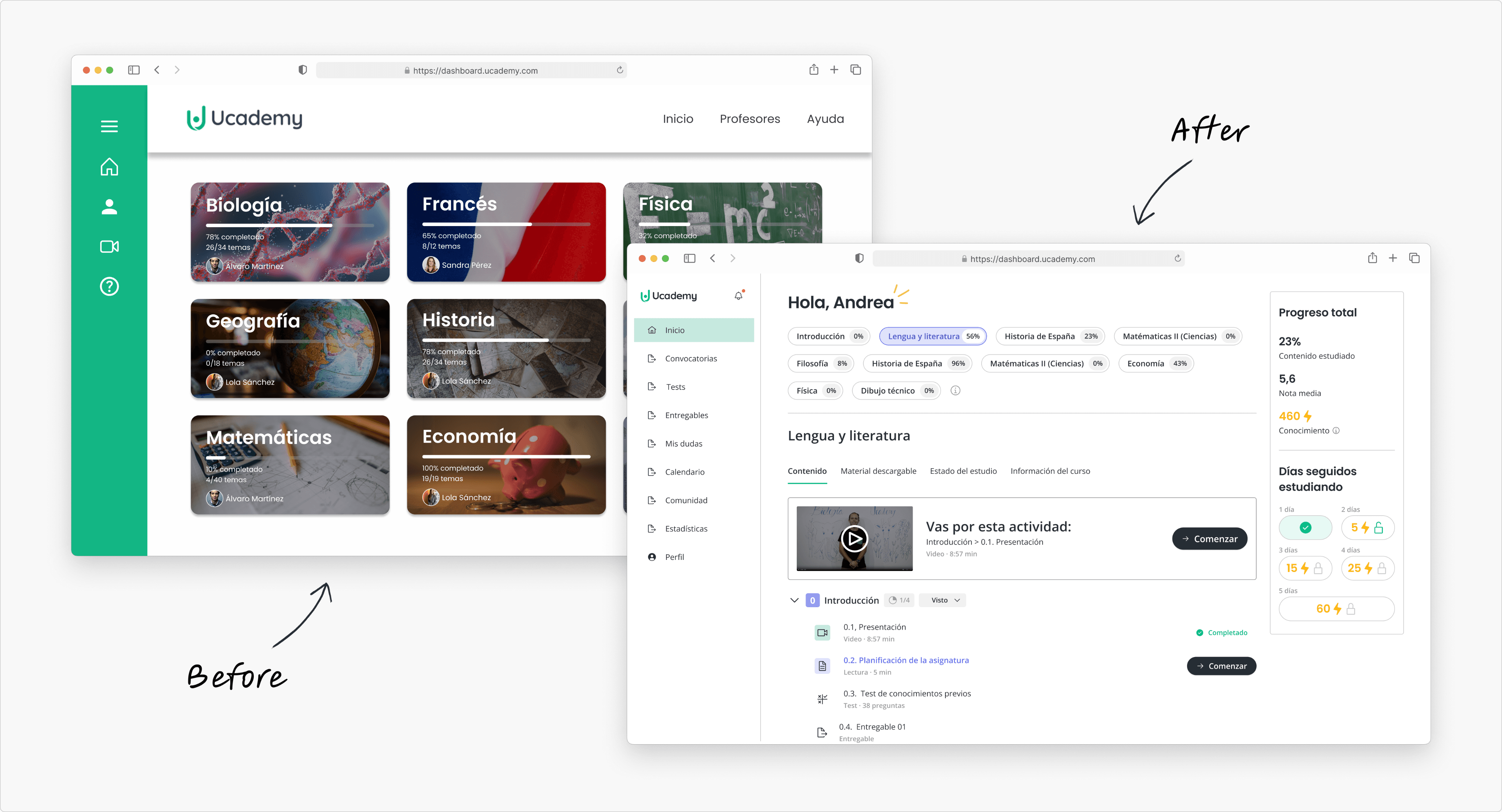
I redesigned the platform from scratch, focusing on building a continuous and motivating learning experience that supported long-term engagement.
Designing for momentum
First of all, students needed to know where to start. That’s why we implemented a personalized onboarding flow:
From the very first interaction, students were guided to:
Define a clear goal.
Understand their path.
See what “progress” would look like.
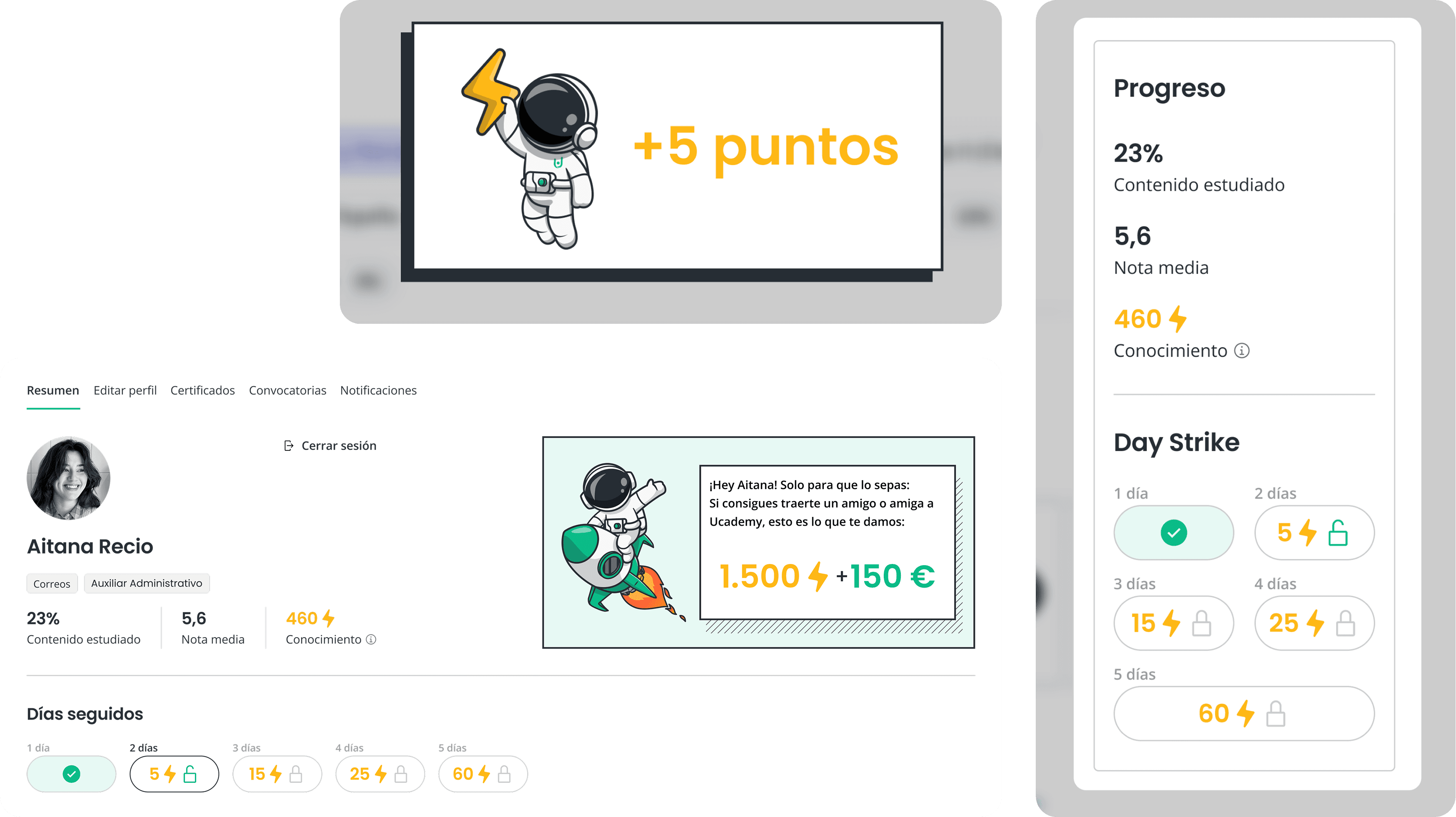
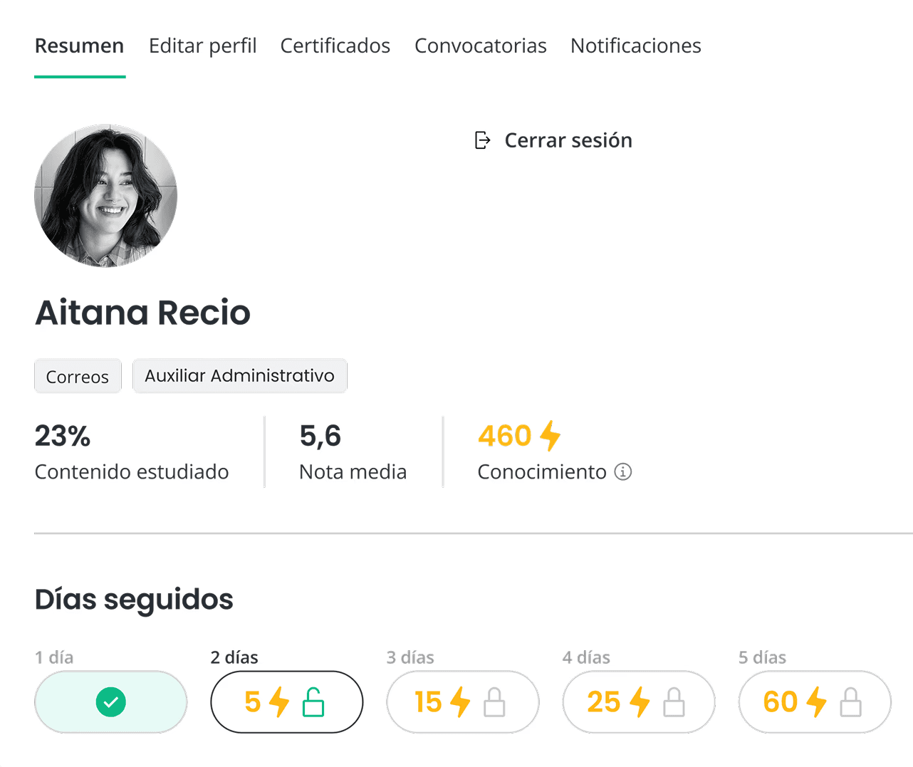
Turning progress into a feeling
One of the biggest gaps was emotional feedback. Students were completing lessons, but they weren’t feeling advancement.
We introduced:
Clear progress tracking tied to goals.
Gamified reinforcement loops to celebrate small wins.
Visual continuity between sessions to reduce restart friction.
Microinteractions that rewarded effort, not just completion.
The objective wasn’t to gamify for the sake of it. It was to transform abstract progress into something visible and tangible. Small wins compound into long-term retention.
Impact

NPS increased from –25 to +47 after launch

Significant improvement in user satisfaction and engagement
Established a strong foundation for a more scalable product evolution
Greater clarity across the student journey
What I’d do differently
More longitudinal research
I would invest more in understanding long-term behavior to better capture motivation cycles and learning patterns over time.
Habit-building experiments
I would explore additional reinforcement and gamification systems to strengthen habit formation.
Earlier personalization
I would introduce adaptive and personalized learning models sooner to improve relevance and outcomes.
Stronger onboarding
I would invest even more in the early experience to better align expectations, reduce early drop-off, and build commitment from the start.
Key learnings
Motivation is a design challenge, not just a content problem.
Clarity reduces churn more effectively than adding new features.
Designing for habits drives long-term impact.
Visible progress is one of the strongest drivers of engagement.
Check other projects